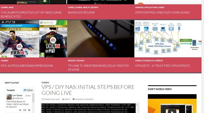
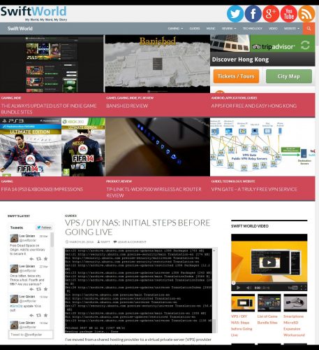
You must have noticed the overhaul in the website design and layout. This change has been a long time coming having used the previous design for roughly 5 years thereabouts. It was hard to find something I like better. I have been searching every now and then for quite some time but nothing seemed to wow me. I had thought about designing one and coding it myself but it just seemed to be a little too overwhelming for a mind that lacks creativity and an eye that fails in spotting artistic beauty. What you see now is a slightly modified version (work in progress but mostly completed) of a theme that gave me a really good first impression.
It is weird though how I chanced upon this theme. You would have thought that since the theme comes with WordPress installations by default I should know about it. To be honest, I have never looked or paid any attention to all the default themes since WordPress started updating them and including new ones annually (I believe it started in 2010). I’ve always looked to custom designs and themes featured on your popular design websites. I guess sometimes what you want is already there right beside you. It was by pure accident that I viewed the theme page in the WordPress admin area where I saw the screenshot preview of Twenty Fourteen. It looked gorgeous. I went to preview it and I knew that it was something I could work on.
One of the main reasons why I was reluctant to change from my old design is because it had quite a few unique functions that I relied heavily upon. That said, I wasn’t too afraid to try port some of those functions over to the new theme. Feeling determined and wanting to use my free time to do something useful and productive, I decided that this was it.
Twenty Fourteen’s colour scheme is beautiful but I wanted something less overpowering. The heavy usage of black with touches of green pops out too strongly for my taste. I wanted something simpler and lighter while still maintaining that initial “popping†factor. I thus went searching for different colour schemes trying to mix and match to the best of my ability. I think the current colours are refreshing and striking enough. What do you think?
The layout needed some changes too. It was difficult to modify the theme having no knowledge in PHP or CSS coding. It is to my advantage though having learnt a programing language in the past so some concepts and ideas were easier to grasp. Nevertheless, it took me some time to understand (partially most of the time seeing how some things are still broken) how each element interacted with each other. With the help of browser inspection tools (to identify the different parts of the site) and Google’s almighty search engine, I was able to make most of the changes I wanted mainly through trial and error.
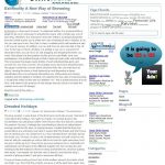
There are still some things that I want to change but haven’t figure out how. It will do for now. Here are the few changes Swift World had undergone in the past few years.
Here is the latest change. I present to you, Swift World Twenty Fourteen:


One thought on “Swift World Twenty Fourteen”